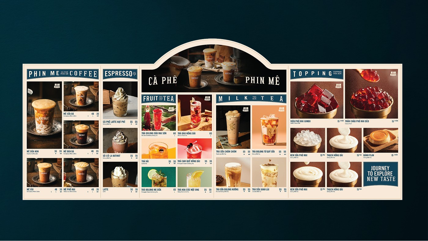
Menu
Menu
Katinat
Coffee & Tea House
Team
Creative Director: Tin Lai
Account & Tagline: Lam Hoang
Type Design: Hieu Le, Kien Mai
Designers: Trang Tran, Kien Mai, Tram Dinh, Audrey
Photography & Imagery: Khunbler, Katinat Team
Team
Creative Director: Tin Lai
Designer: Trang Tran, Kien Mai
Type Design: Hieu Le, Kien Mai
Photography: Khunbler
Team
Creative Director: Tin Lai
Designer: Trang Tran, Kien Mai
Type Design: Hieu Le, Kien Mai
Photography: Khunbler
Year
2023
Sector
Coffee Shop
Scope
Strategy
Brand Identity
Type Design
Scope
Brand Identity
Type Design
Scope
Brand Identity
Type Design
BACKGROUND Established in 2016 under Katinat Café Joint Stock Company, Katinat Saigon Kafe was originally positioned as a modern coffee chain infused with the nostalgic charm of old Saigon – its name inspired by Catinat, one of the first iconic streets of this vibrant city. Following a period of hyper growth post – 2021, the brand exploded in scale. It became a phenomenon among younger generations, celebrated for its tea and coffee offerings alongside highly anticipated seasonal product innovations. By aggressively securing prime corner locations at major intersections, Katinat rapidly captured the market, offering ultimate convenience, high visibility, and successfully catering to the diverse tastes of various age groups, with a particular stronghold on Gen Z.
BACKGROUND Established in 2016 under Katinat Café Joint Stock Company, Katinat Saigon Kafe was originally positioned as a modern coffee chain infused with the nostalgic charm of old Saigon – its name inspired by Catinat, one of the first iconic streets of this vibrant city. Following a period of hyper growth post – 2021, the brand exploded in scale. It became a phenomenon among younger generations, celebrated for its tea and coffee offerings alongside highly anticipated seasonal product innovations. By aggressively securing prime corner locations at major intersections, Katinat rapidly captured the market, offering ultimate convenience, high visibility, and successfully catering to the diverse tastes of various age groups, with a particular stronghold on Gen Z.
BACKGROUND Established in 2016 under Katinat Café Joint Stock Company, Katinat Saigon Kafe was originally positioned as a modern coffee chain infused with the nostalgic charm of old Saigon – its name inspired by Catinat, one of the first iconic streets of this vibrant city. Following a period of hyper growth post – 2021, the brand exploded in scale. It became a phenomenon among younger generations, celebrated for its tea and coffee offerings alongside highly anticipated seasonal product innovations. By aggressively securing prime corner locations at major intersections, Katinat rapidly captured the market, offering ultimate convenience, high visibility, and successfully catering to the diverse tastes of various age groups, with a particular stronghold on Gen Z.

CHALLENGE When Cho Choi Creative took on the project in early 2023, Katinat had already expanded to 50 stores. This rapid expansion, however, led to inconsistencies across its visual identity. Meanwhile, the Vietnamese F&B landscape was witnessing a fierce resurgence in the tea sector and the dominance of industry giants. Katinat faced a critical strategic challenge: the lifespan of a business model relying solely on ambiance and prime locations is short-lived and highly vulnerable without a rock-solid foundation of product quality and consistency. How do we shift the consumer mindset so that Katinat is remembered for its premium ingredients and beverage mixology innovation, thereby elevating the entire customer experience?
CHALLENGE When Cho Choi Creative took on the project in early 2023, Katinat had already expanded to 50 stores. This rapid expansion, however, led to inconsistencies across its visual identity. Meanwhile, the Vietnamese F&B landscape was witnessing a fierce resurgence in the tea sector and the dominance of industry giants. Katinat faced a critical strategic challenge: the lifespan of a business model relying solely on ambiance and prime locations is short-lived and highly vulnerable without a rock-solid foundation of product quality and consistency. How do we shift the consumer mindset so that Katinat is remembered for its premium ingredients and beverage mixology innovation, thereby elevating the entire customer experience?
CHALLENGE When Cho Choi Creative took on the project in early 2023, Katinat had already expanded to 50 stores. This rapid expansion, however, led to inconsistencies across its visual identity. Meanwhile, the Vietnamese F&B landscape was witnessing a fierce resurgence in the tea sector and the dominance of industry giants. Katinat faced a critical strategic challenge: the lifespan of a business model relying solely on ambiance and prime locations is short-lived and highly vulnerable without a rock-solid foundation of product quality and consistency. How do we shift the consumer mindset so that Katinat is remembered for its premium ingredients and beverage mixology innovation, thereby elevating the entire customer experience?

BRAND APPROACH Through in-depth research married with the brand’s long term vision, Cho Choi Creative repositioned Katinat as the "It Girl" of the F&B market – talented, prominent, and unapologetically confident. Everything the brand does exudes passion, meticulous craftsmanship, and an trendsetting energy that others look up to and learn from.
BRAND APPROACH Through in-depth research married with the brand’s long term vision, Cho Choi Creative repositioned Katinat as the "It Girl" of the F&B market – talented, prominent, and unapologetically confident. Everything the brand does exudes passion, meticulous craftsmanship, and an trendsetting energy that others look up to and learn from.
BRAND APPROACH Through in-depth research married with the brand’s long term vision, Cho Choi Creative repositioned Katinat as the "It Girl" of the F&B market – talented, prominent, and unapologetically confident. Everything the brand does exudes passion, meticulous craftsmanship, and an trendsetting energy that others look up to and learn from.


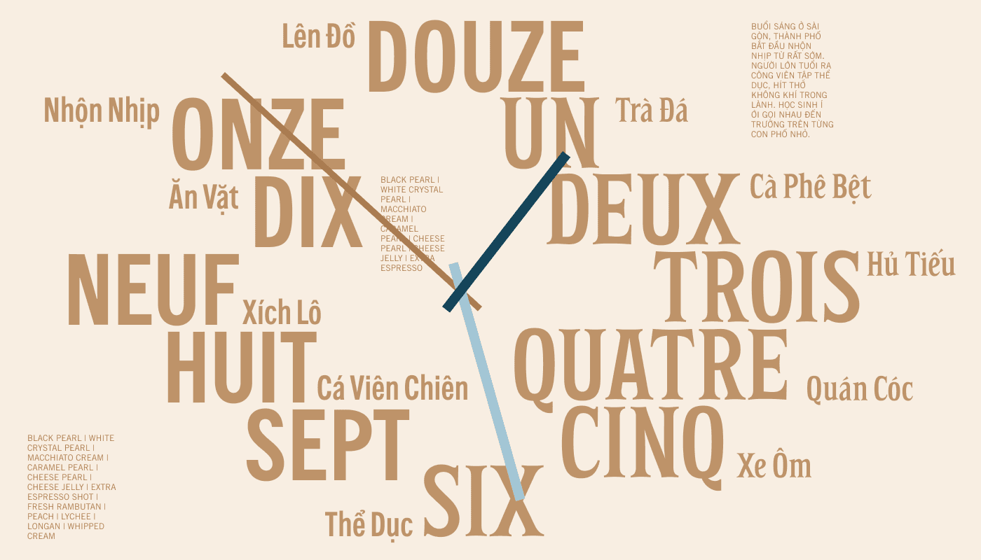
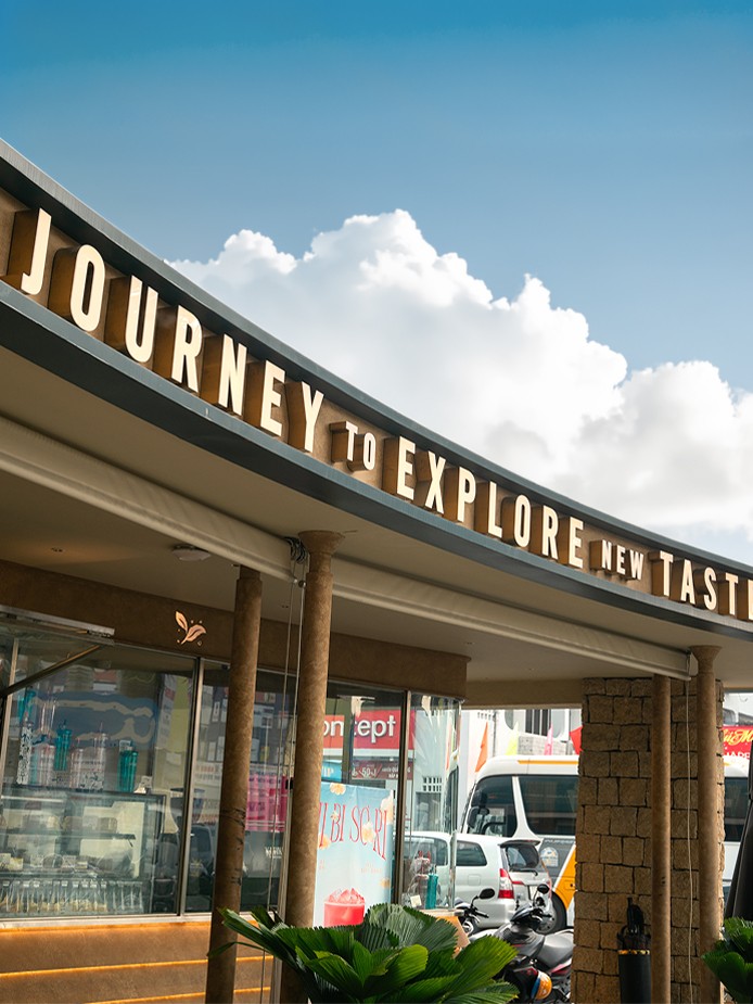
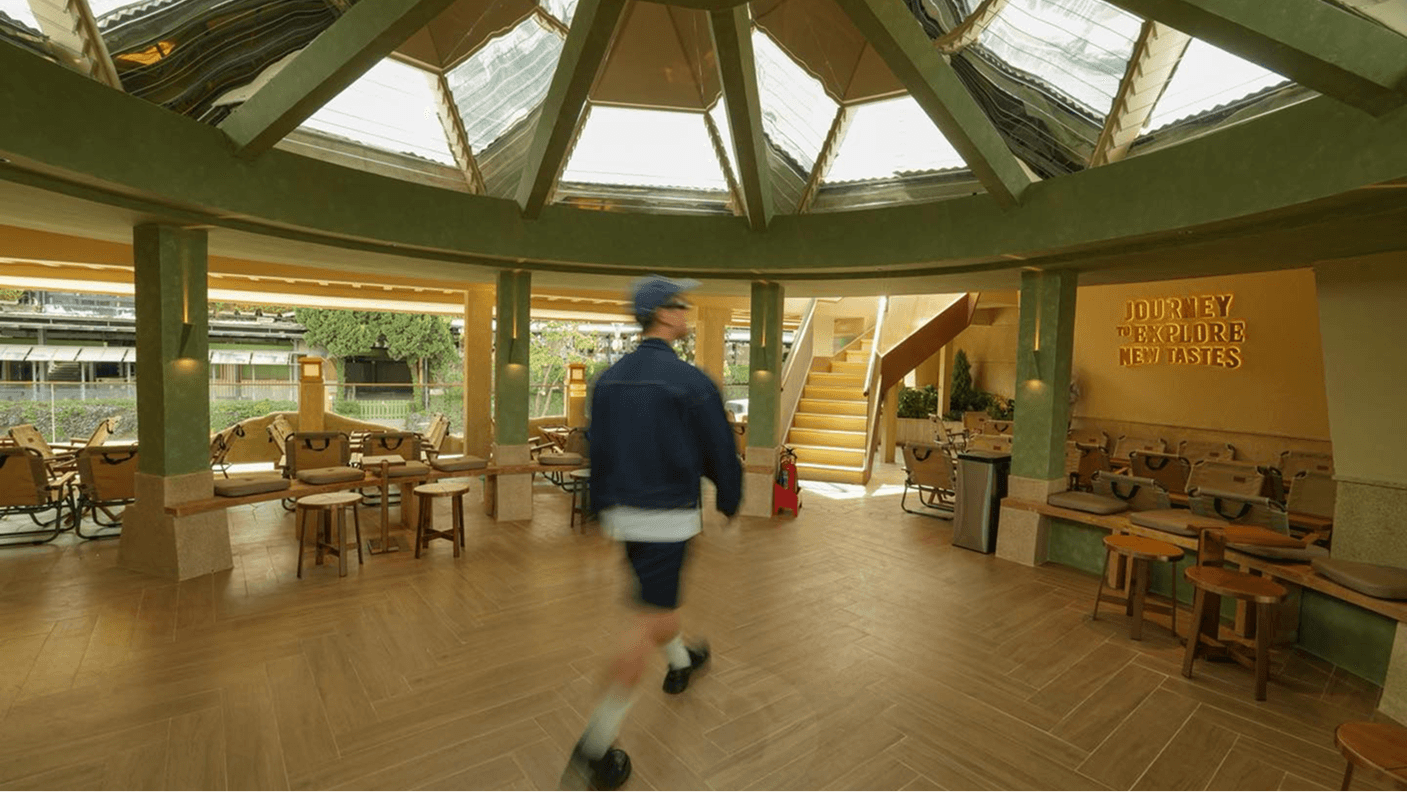
JOURNEY TO EXPLORE NEW TASTE HÀNH TRÌNH CHINH PHỤC PHONG VỊ MỚI
JOURNEY TO EXPLORE NEW TASTE HÀNH TRÌNH CHINH PHỤC PHONG VỊ MỚI
JOURNEY TO EXPLORE NEW TASTE HÀNH TRÌNH CHINH PHỤC PHONG VỊ MỚI
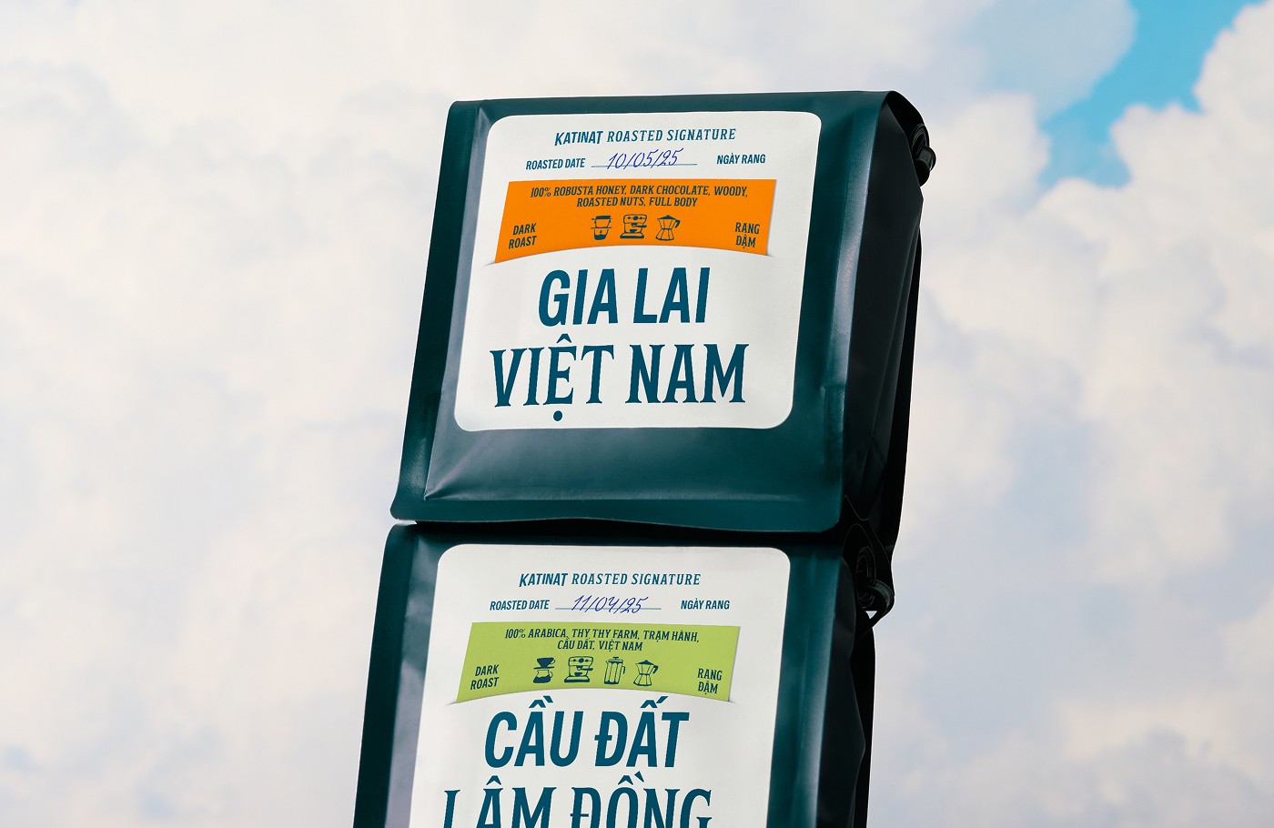
Katinat is on a relentless quest to source premium ingredients from both local provinces and global regions, allowing customers to savor not just a delicious drink, but the distinct "vibe and terroir" (Phong Vị) of its origin. We intentionally chose the Vietnamese term "Phong Vị" over "Hương Vị" (flavor) because it carries a more abstract, metaphorical nuance. It encapsulates the art of savoring life's finer things rather than just taste alone. This journey will not stop within Vietnam; it aims to conquer signature flavors from distinct lands worldwide.
Katinat is on a relentless quest to source premium ingredients from both local provinces and global regions, allowing customers to savor not just a delicious drink, but the distinct "vibe and terroir" (Phong Vị) of its origin. We intentionally chose the Vietnamese term "Phong Vị" over "Hương Vị" (flavor) because it carries a more abstract, metaphorical nuance. It encapsulates the art of savoring life's finer things rather than just taste alone. This journey will not stop within Vietnam; it aims to conquer signature flavors from distinct lands worldwide.
Katinat is on a relentless quest to source premium ingredients from both local provinces and global regions, allowing customers to savor not just a delicious drink, but the distinct "vibe and terroir" (Phong Vị) of its origin. We intentionally chose the Vietnamese term "Phong Vị" over "Hương Vị" (flavor) because it carries a more abstract, metaphorical nuance. It encapsulates the art of savoring life's finer things rather than just taste alone. This journey will not stop within Vietnam; it aims to conquer signature flavors from distinct lands worldwide.
THE HERITAGE CURVE From its inception, Katinat’s core visual system has always been anchored by a rectangle supported by a base curve. Embracing their spirit of sourcing specialty ingredients and continuous R&D, we discovered a perfect intersection between this heritage curve and the rolling silhouettes of boundless tea and coffee hills – thereby anchoring Katinat’s product development strategy deep within the value of Vietnamese agriculture.
THE HERITAGE CURVE From its inception, Katinat’s core visual system has always been anchored by a rectangle supported by a base curve. Embracing their spirit of sourcing specialty ingredients and continuous R&D, we discovered a perfect intersection between this heritage curve and the rolling silhouettes of boundless tea and coffee hills – thereby anchoring Katinat’s product development strategy deep within the value of Vietnamese agriculture.
THE HERITAGE CURVE From its inception, Katinat’s core visual system has always been anchored by a rectangle supported by a base curve. Embracing their spirit of sourcing specialty ingredients and continuous R&D, we discovered a perfect intersection between this heritage curve and the rolling silhouettes of boundless tea and coffee hills – thereby anchoring Katinat’s product development strategy deep within the value of Vietnamese agriculture.

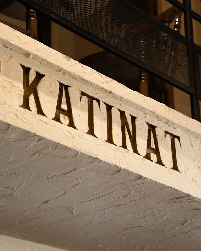
LOGO We preserved the brand’s heritage by refining the structure of the original logo for greater visual harmony, injecting the "Heritage Curve" directly into the wordmark to establish a memorable signature. Furthermore, we developed dynamic logo variants to ensure seamless adaptation across various applications. This flexibility reflects Katinat's commitment to continuous product evolution while staying true to its core identity. Additionally, the original sub-text "KATINAT Saigon Kafé" was evolved into "KATINAT Coffee & Tea House", permanently locked with the logo to emphasize the brand's meticulous focus on its two core pillars: Coffee and Tea.
LOGO We preserved the brand’s heritage by refining the structure of the original logo for greater visual harmony, injecting the "Heritage Curve" directly into the wordmark to establish a memorable signature. Furthermore, we developed dynamic logo variants to ensure seamless adaptation across various applications. This flexibility reflects Katinat's commitment to continuous product evolution while staying true to its core identity. Additionally, the original sub-text "KATINAT Saigon Kafé" was evolved into "KATINAT Coffee & Tea House", permanently locked with the logo to emphasize the brand's meticulous focus on its two core pillars: Coffee and Tea.
LOGO We preserved the brand’s heritage by refining the structure of the original logo for greater visual harmony, injecting the "Heritage Curve" directly into the wordmark to establish a memorable signature. Furthermore, we developed dynamic logo variants to ensure seamless adaptation across various applications. This flexibility reflects Katinat's commitment to continuous product evolution while staying true to its core identity. Additionally, the original sub-text "KATINAT Saigon Kafé" was evolved into "KATINAT Coffee & Tea House", permanently locked with the logo to emphasize the brand's meticulous focus on its two core pillars: Coffee and Tea.
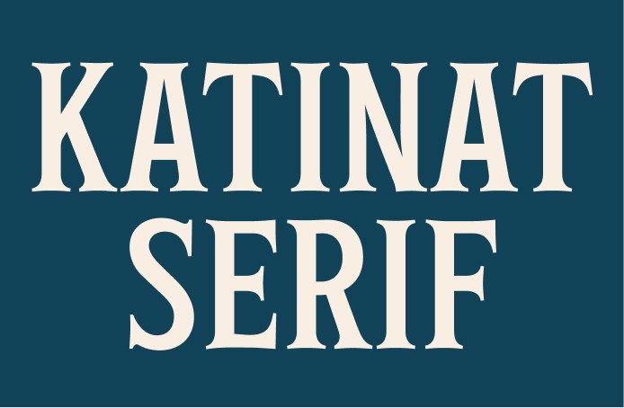

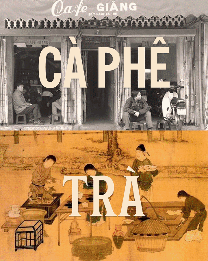
TYPEFACE To create a distinctive and cohesive visual anchor, Cho Choi Creative paired a modern Sans-Serif with a custom-developed Serif typeface. These twin fonts share structural harmony yet visually represent Katinat’s dual signature offerings: Coffee and Tea, while mirroring the Modern vs. Classic duality that appeals to Katinat’s diverse demographic. • Katinat Sans: Prioritizes a bold, clean, and utilitarian aesthetic. • Katinat Serif: Leans into intricate details, artisanal craftsmanship, and features the brand's signature curves.
TYPEFACE To create a distinctive and cohesive visual anchor, Cho Choi Creative paired a modern Sans-Serif with a custom-developed Serif typeface. These twin fonts share structural harmony yet visually represent Katinat’s dual signature offerings: Coffee and Tea, while mirroring the Modern vs. Classic duality that appeals to Katinat’s diverse demographic. • Katinat Sans: Prioritizes a bold, clean, and utilitarian aesthetic. • Katinat Serif: Leans into intricate details, artisanal craftsmanship, and features the brand's signature curves.
TYPEFACE To create a distinctive and cohesive visual anchor, Cho Choi Creative paired a modern Sans-Serif with a custom-developed Serif typeface. These twin fonts share structural harmony yet visually represent Katinat’s dual signature offerings: Coffee and Tea, while mirroring the Modern vs. Classic duality that appeals to Katinat’s diverse demographic. • Katinat Sans: Prioritizes a bold, clean, and utilitarian aesthetic. • Katinat Serif: Leans into intricate details, artisanal craftsmanship, and features the brand's signature curves.


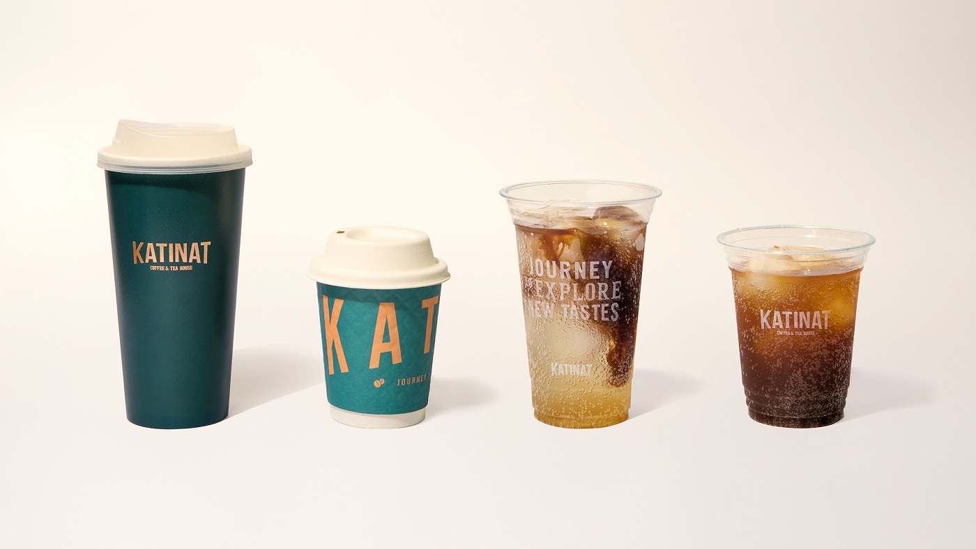
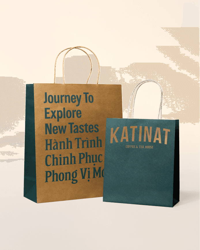
ADAPTATION To craft an unmistakable brand signature, Cho Choi Creative seamlessly deployed Katinat’s dynamic logo variants across all packaging touchpoints, from takeaway cups to pastry boxes. Accompanied by the new tagline, the packaging serves as a proud, visual proclamation of a flexible, liberated Katinat – one that is always ready to transform and reinvent itself.
ADAPTATION To craft an unmistakable brand signature, Cho Choi Creative seamlessly deployed Katinat’s dynamic logo variants across all packaging touchpoints, from takeaway cups to pastry boxes. Accompanied by the new tagline, the packaging serves as a proud, visual proclamation of a flexible, liberated Katinat – one that is always ready to transform and reinvent itself.
ADAPTATION To craft an unmistakable brand signature, Cho Choi Creative seamlessly deployed Katinat’s dynamic logo variants across all packaging touchpoints, from takeaway cups to pastry boxes. Accompanied by the new tagline, the packaging serves as a proud, visual proclamation of a flexible, liberated Katinat – one that is always ready to transform and reinvent itself.


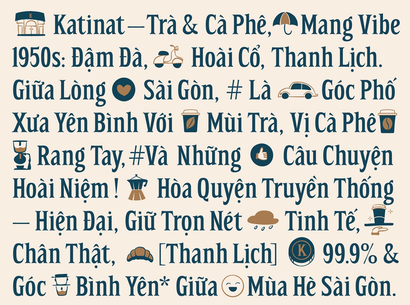
ICON & ILLUSTRATION Embodying the persona of a modern "It Girl" – intelligent, sophisticated, and deep – Cho Choi Creative curated an illustration style inspired by classic French editorial artwork (reminiscent of The New Yorker).
ICON & ILLUSTRATION Embodying the persona of a modern "It Girl" – intelligent, sophisticated, and deep – Cho Choi Creative curated an illustration style inspired by classic French editorial artwork (reminiscent of The New Yorker).
ICON & ILLUSTRATION Embodying the persona of a modern "It Girl" – intelligent, sophisticated, and deep – Cho Choi Creative curated an illustration style inspired by classic French editorial artwork (reminiscent of The New Yorker).


Featured


Visit
435 Phan Xich Long,
Ward 4, Phu Nhuan Dist.,
Ho Chi Minh City
© ChoChoi
Established 2020
Visit
435 Phan Xich Long,
Ward 4, Phu Nhuan Dist.,
Ho Chi Minh City
© ChoChoi
Established 2020