Menu
Menu
The Running Bean
Team
Design: Trang Tran
Creative Director: Tin Lai
Photography: Trang Tran
Animation: Dinh Kien
Team
Design: Trang Tran
Creative Direction: Tin Lai
Photography: Trang Tran
Animation: Dinh Kien
Team
Design: Trang Tran
Creative Direction: Tin Lai
Photography: Trang Tran
Animation: Dinh Kien
Year
2023
Sector
Coffee Shop
Scope
reBranding
Type Design
Scope
reBranding
Type Design
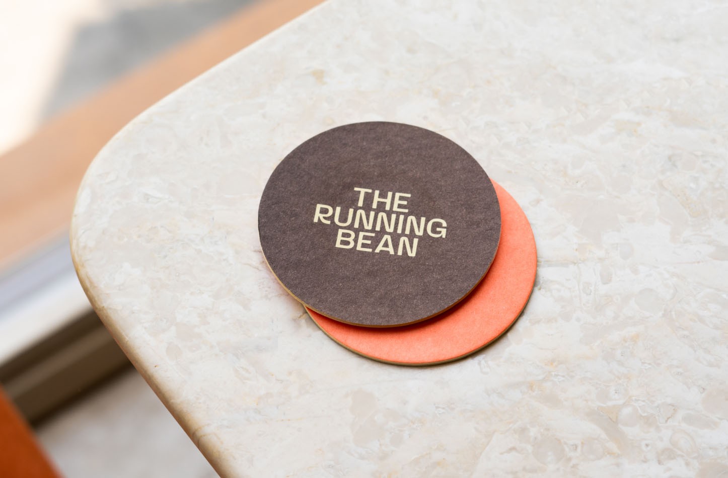
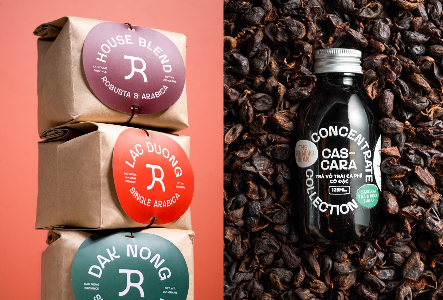
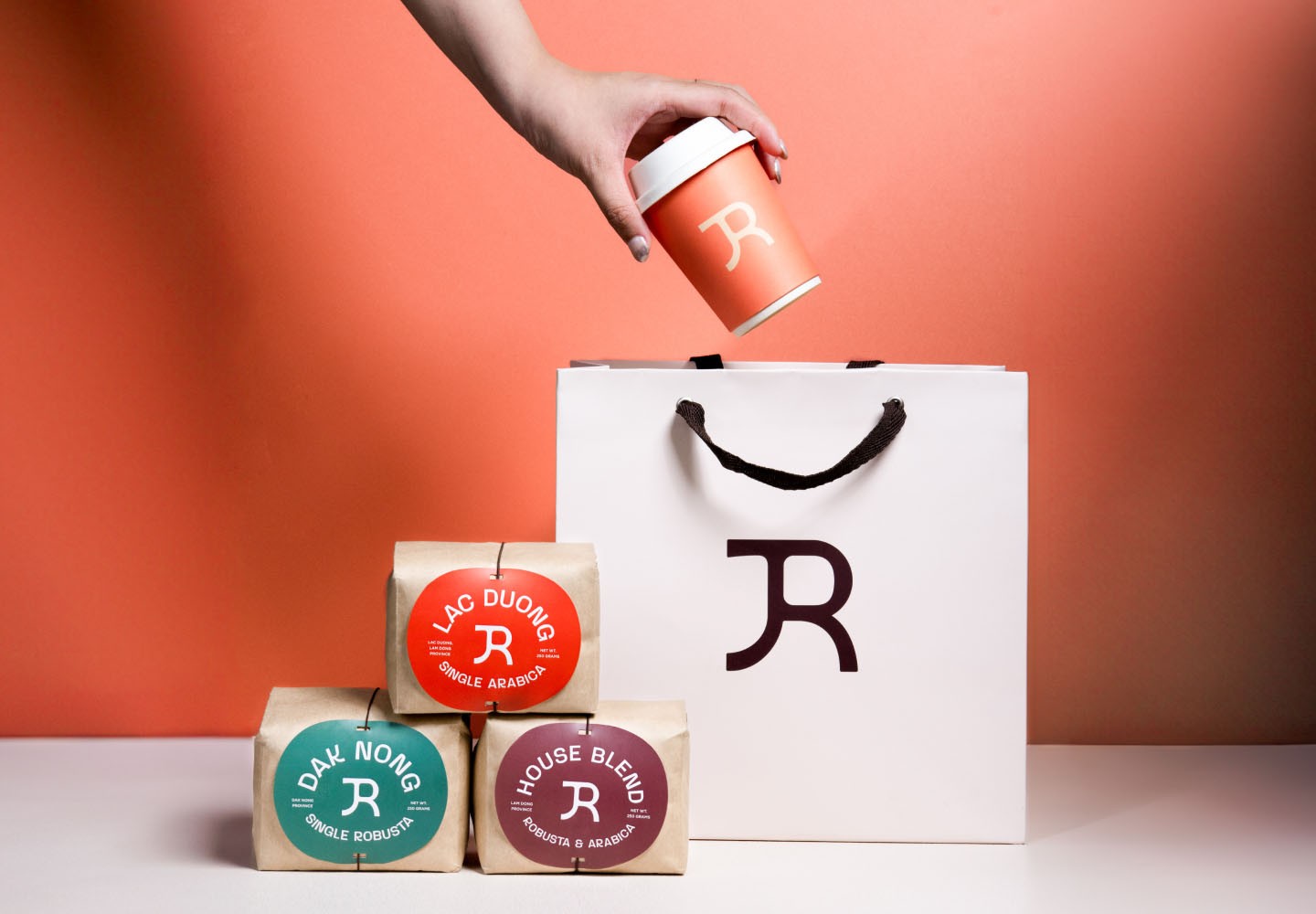
To rejuvenate the brand without losing their existing customer base, The Running Bean needs a new, friendly and approachable image. This image should be consistently portrayed and unified, whether it's for everyday interactions or special occasions throughout the year. By achieving this, The Running Bean aims to strike a balance between modernizing their brand and retaining customer loyalty.
To rejuvenate the brand without losing their existing customer base, The Running Bean needs a new, friendly and approachable image. This image should be consistently portrayed and unified, whether it's for everyday interactions or special occasions throughout the year. By achieving this, The Running Bean aims to strike a balance between modernizing their brand and retaining customer loyalty.
To rejuvenate the brand without losing their existing customer base, The Running Bean needs a new, friendly and approachable image. This image should be consistently portrayed and unified, whether it's for everyday interactions or special occasions throughout the year. By achieving this, The Running Bean aims to strike a balance between modernizing their brand and retaining customer loyalty.
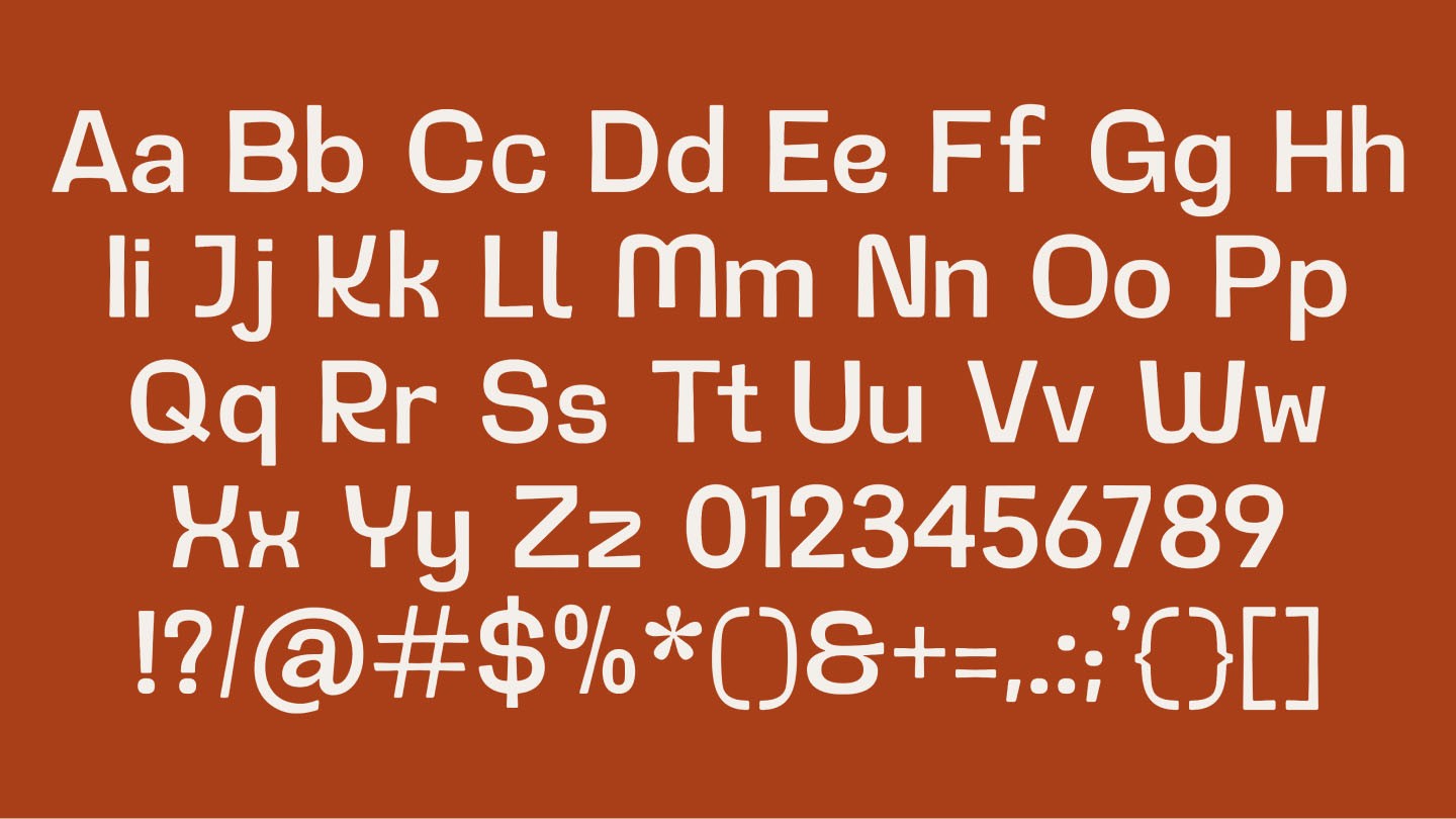
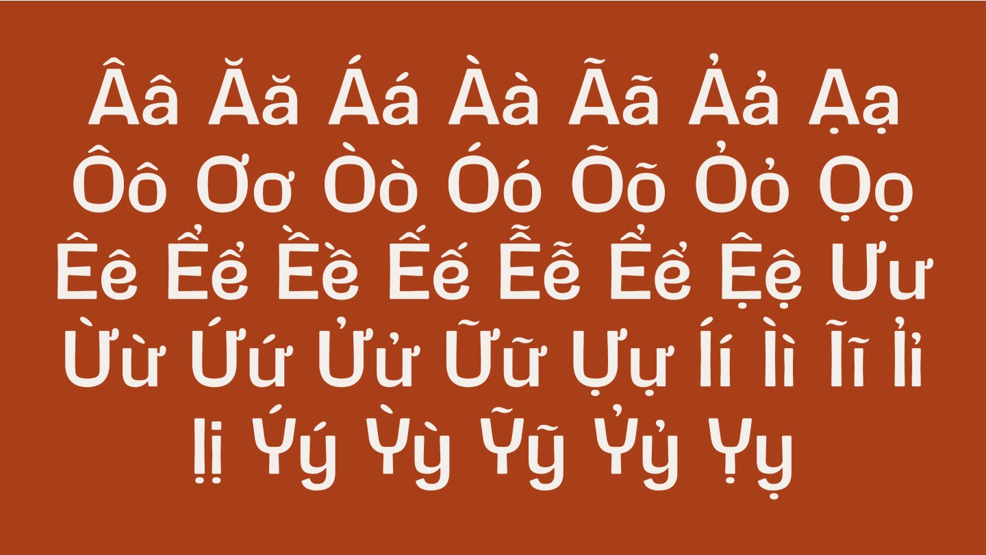
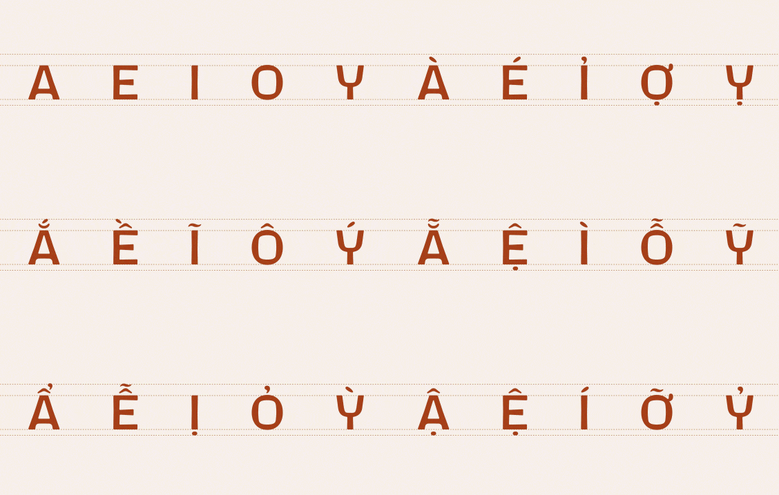
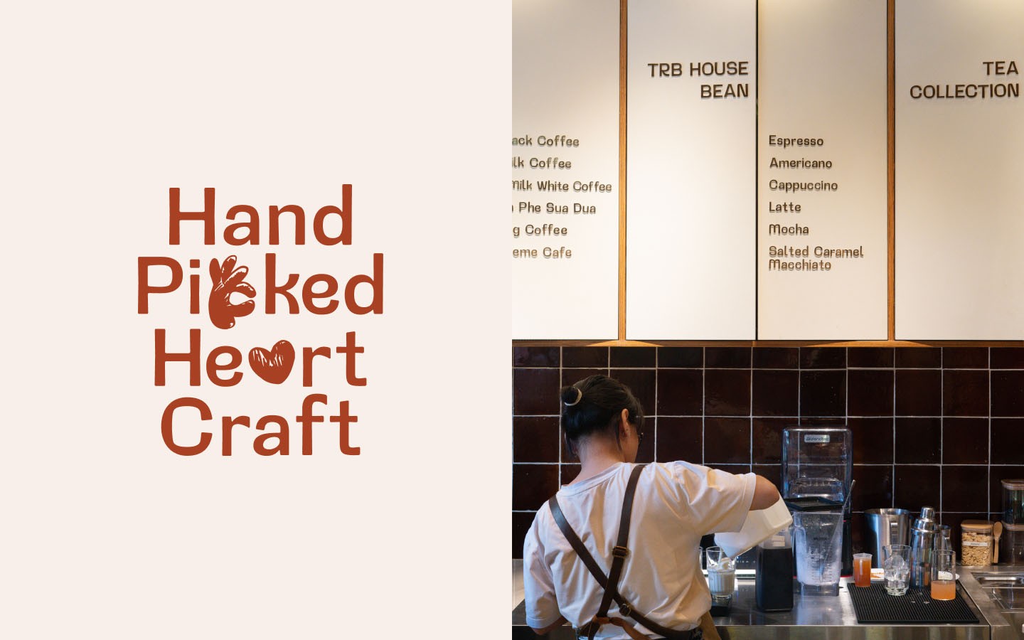
Built upon the original character set - Intro Black, we have carefully refined the font to preserve its Humanist essence. This not only adds a touch of friendliness, but also softens its inherent rigidity. Additionally, we have incorporated architectural elements from the space to give the font a warm and approachable feel that truly embodies the spirit of The Running Bean.
Built upon the original character set - Intro Black, we have carefully refined the font to preserve its Humanist essence. This not only adds a touch of friendliness, but also softens its inherent rigidity. Additionally, we have incorporated architectural elements from the space to give the font a warm and approachable feel that truly embodies the spirit of The Running Bean.
Built upon the original character set - Intro Black, we have carefully refined the font to preserve its Humanist essence. This not only adds a touch of friendliness, but also softens its inherent rigidity. Additionally, we have incorporated architectural elements from the space to give the font a warm and approachable feel that truly embodies the spirit of The Running Bean.




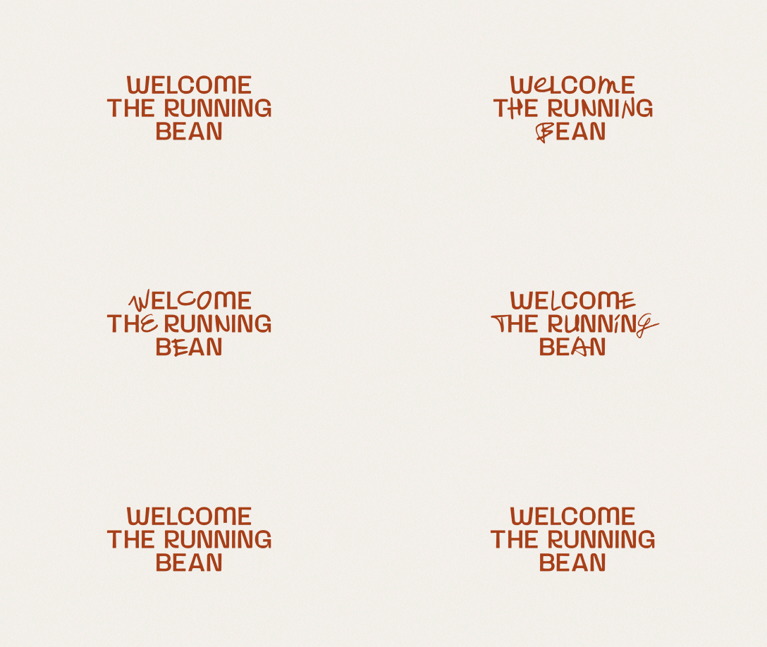
We have a promising campaign idea in orther to express our appreciation and pay tribute to our valued customer at The Running Bean. The plan is to collect handwritten messages of them, these handwritten letters will be combined with our typeface to create an image for the campaign. This serves as a testament to the respect we hold for each customer who has graced us with their presence.
We have a promising campaign idea in orther to express our appreciation and pay tribute to our valued customer at The Running Bean. The plan is to collect handwritten messages of them, these handwritten letters will be combined with our typeface to create an image for the campaign. This serves as a testament to the respect we hold for each customer who has graced us with their presence.
We have a promising campaign idea in orther to express our appreciation and pay tribute to our valued customer at The Running Bean. The plan is to collect handwritten messages of them, these handwritten letters will be combined with our typeface to create an image for the campaign. This serves as a testament to the respect we hold for each customer who has graced us with their presence.


Intriguing coffee bean imagery graces the labels of our brewing equipment. When displayed side-by-side, these labels form a captivating mosaic, instantly recognizable and easy to navigate. It's a delightful touch that adds a touch of whimsy and convenience to the user experience.
Intriguing coffee bean imagery graces the labels of our brewing equipment. When displayed side-by-side, these labels form a captivating mosaic, instantly recognizable and easy to navigate. It's a delightful touch that adds a touch of whimsy and convenience to the user experience.
Intriguing coffee bean imagery graces the labels of our brewing equipment. When displayed side-by-side, these labels form a captivating mosaic, instantly recognizable and easy to navigate. It's a delightful touch that adds a touch of whimsy and convenience to the user experience.






Visit
435 Phan Xich Long,
Ward 4, Phu Nhuan District,
Ho Chi Minh City
© ChoChoi
Based in Saigon
Late 2020
Visit
435 Phan Xich Long,
Ward 4, Phu Nhuan District,
Ho Chi Minh City
© ChoChoi
Based in Saigon
Late 2020
Visit
435 Phan Xich Long,
Ward 4, Phu Nhuan District,
Ho Chi Minh City
© ChoChoi
Based in Saigon
Late 2020


